There’s no place like your homepage. It’s the hub of your website, the heart of your content, and it’s often the starting point for your visitors. And that makes it ultra important. So here the essential features your homepage copy must have if you want to convert visitors into leads.
The best landing pages will promote benefits
So many websites miss out on this, the most important part. Customers and clients are selfish people. They want to know what’s in it for them. And so they should! So you’ve got to get the benefits across to visitors straight away.
Don’t wait until the 3rd paragraph because if your visitor hasn’t found the benefit straight away, they probably won’t make it to the third paragraph!
So what benefits do you offer your visitors?
- Save money
- Save time
- Peace of mind
- Easy life
- Less stress
- Expert tips
- Increased revenue
Get to the heart of the main benefit within your first 30-60 words and give your visitors a reason to keep reading.
And if there are lots of benefits, sprinkle the rest across the copy as you guide them through your content.

Looking for landing page inspiration? Look no further than the call to action

Without a call to action, you can’t expect your visitors to take action.
Your call to action (CTA) is there to make it explicitly clear what you want your visitors to do. Without a CTA, you’re hoping that they come to the right decision. You want them to be mind readers!
So make sure your CTA is easy to see and clear. Don’t just stick it at the bottom of the page. You have to assume that your audience might not read all of your copy, or scroll down your page. They might want to get straight into the action, so position it carefully.
Why not put a CTA immediately after your opening paragraph with your value statement? Then you can build more value in the rest of the content and hit them with another CTA at the end.
Boom!
The best landing pages will use signposting
96% of your visitors aren’t ready to buy when they come to your homepage, so you’ve got to build positive reasons to buy from you. And that can’t all be done on the one page.
But remember that you know what you do better than your visitors. And you know where the best content on your website is. So rather than just relying on the navigation bar to show your visitors where to go next, guide them through it with links in your content (like I’ve done a couple of times here in this article).
That way, you’re directing people towards content that you know will be relevant to them and build value into their experience on your website.
The better the experience, the more likely they are to stay on your pages, and the more likely they are to buy from you.
What you do
Seems like a silly point doesn’t it? Well, yes I suppose it is. But you’d be surprised how many websites don’t make it clear what they actually do. You have to go digging if you want to find out. That’s if you can be bothered.
If it isn’t clear what you do from the outset, you’re creating a barrier that’s preventing people from going any further. That increases the chances of visitors going elsewhere and checking out your competitors.
So you’ve got to get what you do across straight away. Try to write a sentence of no more than 30 words in the opening paragraph that includes both the main thing you do, and the main benefit.
If your company offers lots of products and types of services; say, you’re a e-commerce site selling a range of sporting equipment, then say that. Use your CTAs after to direct people to the relevant section of the site. You don’t have to say everything about what you do in the homepage.
Just make sure you’re directing people with your CTAs to where they should go.
Landing page inspiration will revolve around great sub-headings
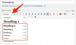
These are really useful for a few of reasons.
Firstly, it makes your content easier to skim and scan, especially if you have a scrolling homepage or lots of information.
It allows you to have a lot more content on there and still not be too overbearing for your visitors. They can see clearly from your sub-headings which sections are interesting or relevant to them.
Secondly, it gives you another opportunity to tell Google what you do. When Google looks at your site, it will take a look at all your H-tags. So if you H2 (sub-heading) tags have got your focus keyword or relevant keywords in it, it strengthens your search engine optimisation.
Finally, it helps to create white space. And white space, or just empty space, can be just as important as the information. It allows you visitors to see more clearly the relevant content and leaves them feeling less cluttered and daunted by the content in front of them.
Social Media Buttons
Google continues to push people to create good quality, valuable content. People have to like your content if you want to make the most out of it. And if people like it and share it, it will improve you search engine ranking.
So again don’t put a barrier in the way and make it harder than it should be to share your content. Make your social media buttons visible all the time so it’s easy to spread the word.
Surely there’s more to landing page inspiration?
Without going too much into the design aspect of a homepage, there’s lots more that you could include on a homepage to make it really powerful.
You might add testimonials, or the main features, or success indicators. But that really depends on your business, the products and services you sell, and the availability or quality of the content you’ve got.
So if you can make sure that your homepage has all of the features mentioned in this article, you’re at the very least part way to having a great homepage without having to put too much effort in!